Color enables end users to quickly interpret the meaning of data presented in charts. Using colors helps to distinguish categories, represent quantities, highlight specific data, and convey a story.
Types of color
Categorical
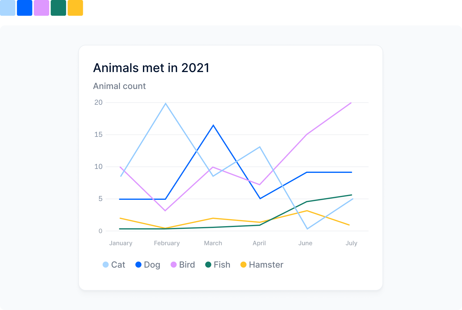
The categorical palette uses colors that are distinct from one another. A categorical palette is ideal for displaying variables that are unrelated to each other.

Sequential
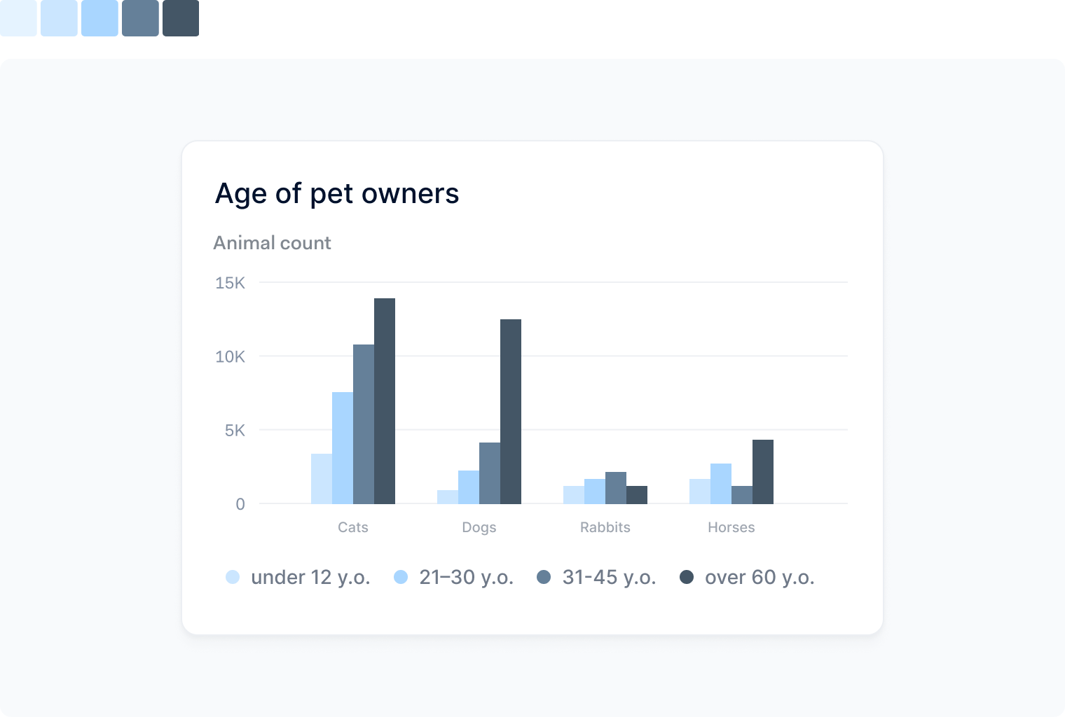
The sequential palette uses a single color in different saturations or in a gradient. A sequential palette is ideal for displaying information that is numeric or has a natural order, such as age.

Diverging
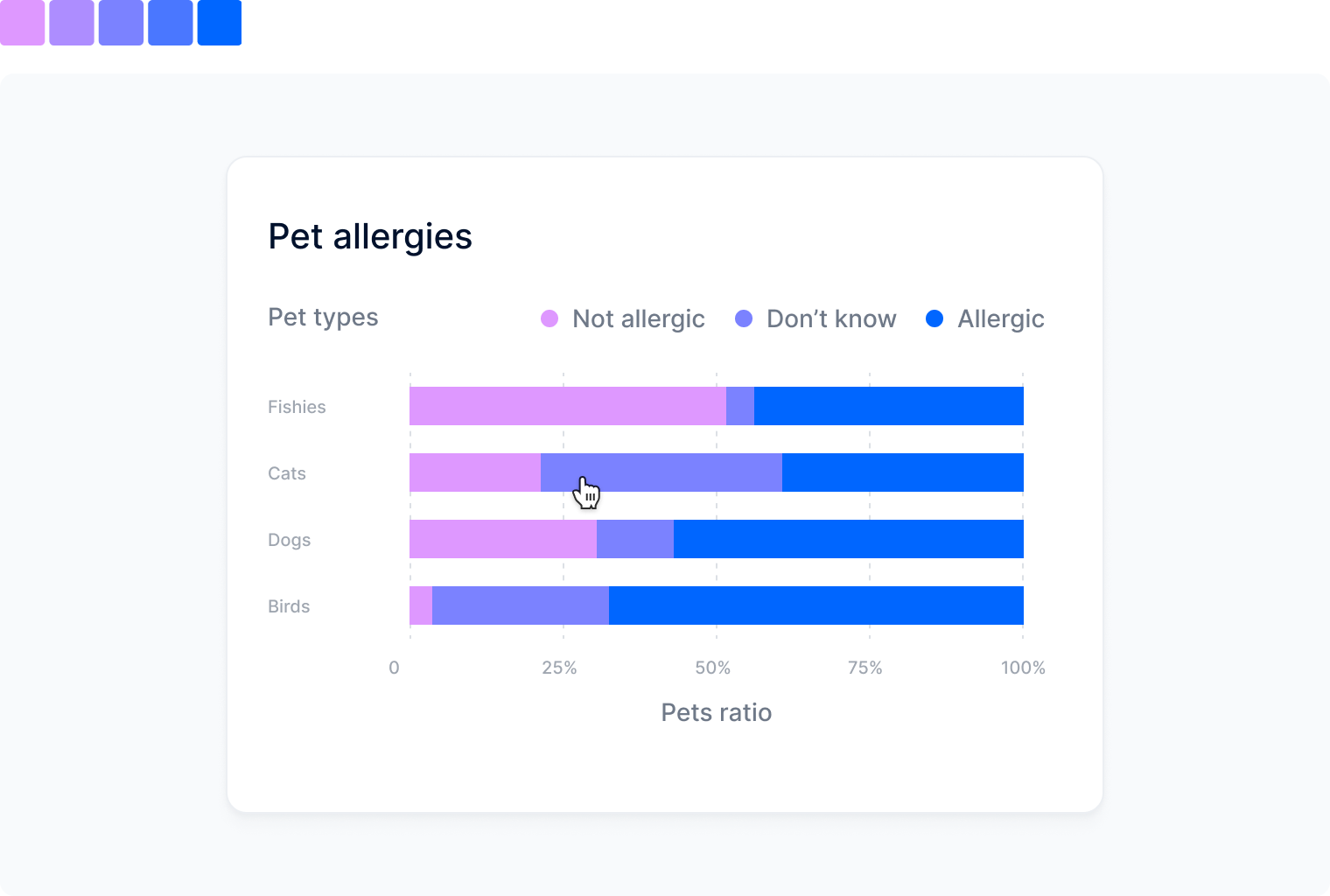
The diverging palette uses two sequential palettes with a shared point in the middle. A diverging palette is ideal for displaying information that is numeric and has a meaningful center value.

Usage guidelines
For sequential and diverging colored charts, use lighter hues to represent low values and darker hues to
represent high values.
When using fewer than five colors in sequential and divergent colored charts, always use the base color and colors that are very contrasting.
Always use our color pairings (see below) and be mindful of the context when selecting them.
For example: line charts work better in darker hues.
Always pick the same color to represent the same topic in a dashboard.
Color pairings
Color pairings are sets of colors that should be used when creating a chart with one or multiple variables.
- For one-colored charts, use:
or
or
- For two-colored charts, use:
or
- For three-colored charts, use:
- For four-colored charts, use:
- For five-colored charts, use:
Color consistency
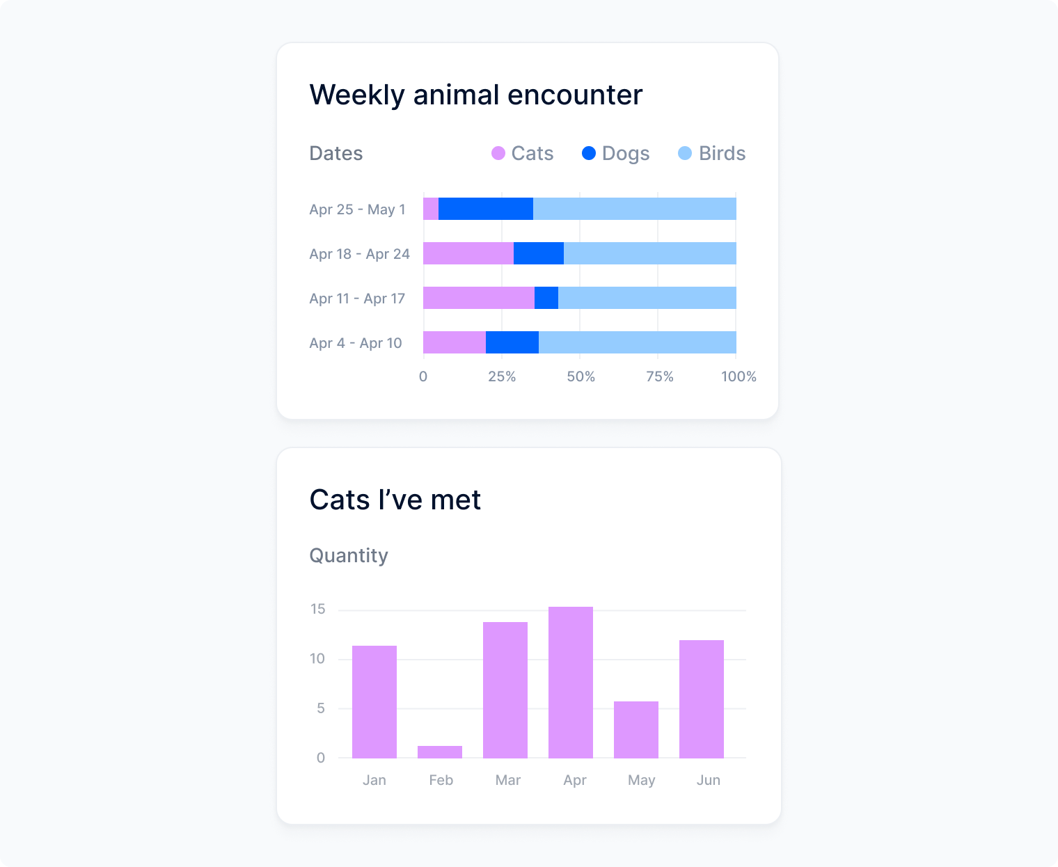
As a general rule of thumb, you should always be consistent with your color selection and what it represents in your data visualization. Humans naturally perceive color as a pattern, so when they see a color across multiple charts in one dashboard, they will assume it's a representation of the same topic.

Color codes